Color is more than just making things look good. It’s a powerful tool in graphic design. When you design a logo, website, or poster, the colors you choose send messages to your audience. This guide shows how color theory and design principles can make your designs stand out.
Find out how to avoid color mistakes and learn how to create designs that grab attention. You’ll learn about choosing the right colors and how they affect people’s feelings. This article gives you the tools to make every project shine.
Key Takeaways
- Learn how color psychology shapes viewer emotions and actions.
- Master color schemes (complementary, analogous) to create harmony.
- Avoid common mistakes like clashing tones or overwhelming palettes.
- Use color to guide attention and build visual hierarchies.
- Align brand colors with company values for instant recognition.
Understanding the Fundamentals of Color Theory
Every successful graphic design project starts with mastering color theory basics. At the heart of this system is the color wheel. This tool has been used since the 18th century to organize color relationships. It’s a circular diagram that shows how hues interact, mix, and contrast.
The Color Wheel Explained
Designers use the color wheel to create harmonious palettes. It organizes colors into 12 standard shades. This shows which colors pair well together. For example, complementary colors like blue and orange create high contrast.
Primary, Secondary, and Tertiary Colors
- Primary: Red, yellow, blue—cannot be mixed from other colors
- Secondary: Green, orange, purple—mixes of two primary colors
- Tertiary: Colors like red-orange or blue-green bridge primary and secondary shades
Warm vs. Cool Colors and Their Impact
| Warm Colors | Cool Colors |
|---|---|
| Red, orange, yellow | Blue, green, purple |
| Evokes energy, urgency, warmth | Suggests calmness, professionalism |
| Used in fast-food branding | Popular in tech or healthcare designs |
Understanding these principles helps graphic designers choose palettes that guide emotions and messages effectively. From packaging to digital interfaces, these fundamentals are key for visual communication.
The Psychology Behind Color Choices in Design
Understanding color psychology is crucial for effective graphic design. Colors do more than just look good—they evoke emotional responses. This shapes how people see brands and messages.
Red, for example, creates a sense of urgency. That’s why McDonald’s uses it in their logos. On the other hand, blue is calming and trustworthy. Facebook’s app is a great example of this.
- Yellow: Sparks joy and creativity, often used in children’s products.
- Green: Symbolizes growth, used by eco-brands like Patagonia.
- Purple: Evokes luxury, favored by beauty brands like Cadbury.
“Color communicates before any text is read,” says a 2022 MIT study. “It influences decisions in under 90 seconds.”
Culture also plays a role. What white means in the West might be different in Asia. Designers need to understand their audience to avoid misunderstandings. A 2023 Nielsen report showed 85% of consumers choose products based on color.
So, how can you use this to your advantage? For boldness, choose red. For trust, go with blue. Let science help you pick colors that connect with your audience.
Color Schemes That Elevate Your Graphic Design Projects
Mastering color schemes is key to creating impactful graphic design work. Each approach offers unique ways to balance creativity and function. Let’s explore proven strategies used by top designers.
Complementary Color Combinations
Opposing hues on the color wheel, like blue and orange, create bold color combinations. This high-contrast pairing grabs attention instantly. Think of Target’s red and white logo—energy meets simplicity.
Analogous Color Palettes for Harmony
Adjacent colors on the wheel, such as green and teal, blend smoothly. Nature brands like Patagonia use these to evoke calmness and unity. Use 60-30-10 ratios for balance.
Monochromatic Designs for Elegance
Varying shades and tints of one color adds depth without chaos. Chanel’s iconic black gradients exemplify sophistication. Ideal for minimalist layouts.
Triadic and Tetradic Approaches
Three or four evenly spaced colors form dynamic yet stable palettes. Brands like Google use triadic (red, blue, yellow) for lively interfaces. Test these in web layouts for vibrancy.
| Color Scheme | Key Trait | Best Use |
|---|---|---|
| Complementary | High contrast | Logos, ads |
| Analogous | Smooth transitions | Nature themes, websites |
| Monochromatic | Single-hue depth | Luxury branding, brochures |
| Triadic/Tetradic | Dynamic balance | Apps, infographics |
How Color Theory Transforms Web Design Experiences

Good web design starts with the right colors. These colors make the site more engaging and accessible. Bright colors grab your attention, while soft colors help you navigate easily.
Color accessibility isn’t optional—it’s a cornerstone of ethical design that empowers all users to engage with digital spaces.
Here are some tips for making your web project better:
- Choose high-contrast text and backgrounds for better reading.
- Check how your colors look on different devices.
- Use tools like Chrome’s Lighthouse to check color accessibility.
| Contrast Ratio | WCAG Level | Use Case |
|---|---|---|
| 4.5:1 | AA | Body text on light backgrounds |
| 3:1 | A | Headers and interactive elements |
| 7:1 | AAA | Large headings for maximum legibility |
Online stores like Amazon use soothing blues to make shopping easier. Health sites, like Mayo Clinic, use greens for trust and ease of use. By focusing on these, colors become a key part of making sites both beautiful and useful for everyone.
Creating Visual Hierarchy Through Strategic Color Use
Good graphic design uses visual hierarchy to make information easy to follow. Designers use color contrast to guide viewers to what’s important.
Directing Attention with Color Contrast
- Make headlines pop with bold, bright colors.
- Use soft colors for secondary text to keep the main message clear.
- Check contrasts with tools like Adobe Color for clear and accessible designs.
Establishing Information Priority
Color tells viewers what to look at first. Here’s how to set priorities:
| Element | Color Strategy | Goal |
|---|---|---|
| Headers | Saturated, high-contrast colors | Immediate recognition |
| Body Text | Low-contrast neutrals | Supporting details |
| Buttons | Contrasting bright shades | Encourage action |
Creating Focal Points in Your Compositions
“The strongest focal points feel inevitable, not accidental,” notes designer Setrak.
Use color to draw attention. A neon green arrow in a blue background grabs eyes quickly. Add white space to make it even more striking, like Instagram’s red “+” icon.
Graphic Design Color Trends to Watch in 2025

In 2025, contemporary design is seeing bold changes in color palettes. These changes mix new ideas with old favorites. Brands and designers are aiming to create visuals that touch our hearts and connect with our culture. Here’s what’s trending:
- Vibrant Maximalism: Bright colors like electric coral and neon green are taking over. They bring energy and reject simple designs.
- Sustainable Earth Tones: Colors like earthy greens and terracotta show a love for the planet. Brands like Patagonia are using them in their campaigns.
- Digitally Native Colors: Gen Z loves virtual looks, so glitch-inspired gradients and holographic effects are in.
- Retro Nostalgia: The 90s are back with pastels and pixelated neons. You see them in fashion and tech.
| Trend | Description | Example |
|---|---|---|
| Maximalism | Layered, saturated hues | Music festival branding |
| Earth Tones | Biophilic design in packaging | Natura Brands |
| Glitch Effects | Digital art and app interfaces | Canva’s 2025 palette |
| Retro Nostalgia | Pastel gradients and pixel art | Adidas’ vintage remixes |
“Color in 2025 isn’t just visual—it’s a cultural conversation.” – Adobe Color Report 2025
Global events like climate activism and digital immersion are driving these changes. When following trends, remember to consider your audience. For example, a wellness app might use bold colors with calming neutrals. This mix balances energy and calm. Stay flexible—these graphic design trends show how color reflects our changing world.
Mastering Color for Brand Identity and Logo Design
Colors in logo design and brand identity shape how people see a company. A unified color scheme makes a brand easy to spot, whether it’s online or in stores. The right colors make logos unforgettable.
Selecting Colors That Reflect Brand Values
Begin by matching colors with your brand’s core values. For example, a green brand might pick earthy tones, while a high-end brand goes for deep blues. Here’s how to do it:
- Link brand values with color psychology (like red for urgency, blue for trust).
- Check how colors make people feel with your target audience.
- Stick to 2-3 main colors to keep things simple.
Color Consistency Across Platforms
Without color consistency, a brand’s message gets lost. Colors can change from print to digital. Here’s how to keep it consistent:
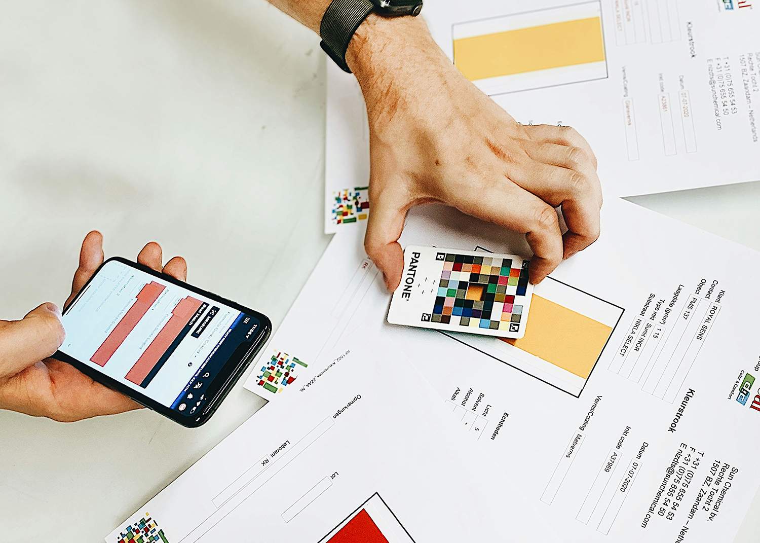
- Use Pantone guides for print and hex codes for digital.
- Test colors on all materials before making a final choice.
Case Studies: Successful Color Strategies in Famous Logos
Iconic logos show the power of smart color choices. Think about:
- Coca-Cola’s red: It’s excited people and built loyalty since 1940.
- McDonald’s yellow and red: It makes people hungry and eager.
“A consistent color palette builds trust faster than any slogan.” – Global Branding Survey 2025
Common Color Theory Mistakes and How to Avoid Them
Designers often miss simple steps that could make their work shine. Here’s how to avoid common design mistakes and improve your designs:
- Ignoring color accessibility: Text that’s too faint or buttons that blend into backgrounds can lose users. Use tools like Contrast Checker to check for 4.5:1 contrast ratios.
- Forcing clashing tones: Jarring color combinations can ruin color harmony. Use triadic schemes or split-complementary palettes for better cohesion.
- Device dependency: Colors look different on various screens. Calibrate monitors to 6500K and test prints with Pantone guides to match digital drafts.
“Color is emotion made visible.” – Josef Albers. Yet, 68% of websites fail basic contrast tests, losing 1 in 5 users with visual impairments. Small changes can make a big difference.
Begin with a 3-color base, check for screen-reader accessibility with Figma’s plugin, and test prints at 300 DPI. By focusing on these steps, you can transform potential mistakes into outstanding results.
Essential Color Tools and Resources for Designers
Every designer needs reliable color tools and design resources to make work easier. Tools like palette generators and educational guides help you get better at color. Start using these today to improve your creative work.
Digital Color Wheels and Palette Generators
Start with free online tools that make creating palettes easy. Try:
- Adobe Color: Sync with Adobe Creative Cloud for web design projects.
- Colors: Auto-generate palettes with real-time adjustments.
- Pantone: Test color harmony using a live preview.
Color Management Software
Keep colors consistent across devices with these tools:
| Tool | Features | Cost | Best For |
|---|---|---|---|
| Adobe Color | Device profiling, batch editing | Free | Quick adjustments |
| X-Rite | Hardware calibration, ICC profiles | Paid | Professional printing |
| ColorMunk | Color space conversion, mobile app | Paid | On-the-go edits |
Books and Courses
Improve your skills with:
- Interaction of Color by Josef Albers (classic theory)
- Coursera’s “Color for Designers” (practical exercises)
- Skillshare’s color psychology courses (project-based learning)
Use these tools and practice to get better at color. Try new things and let these resources help you. This way, you’ll make confident design choices.

Conclusion: Transforming Your Design Practice Through Color Mastery
Every design choice is important, but color stands out the most. This guide has covered the basics of color, from the color wheel to 2025 trends. It shows how color can make your designs stand out.
Color isn’t just about following trends. It’s about knowing how colors can evoke emotions and guide the viewer’s eye. It’s also about building a brand’s identity through color.
When designing websites, logos, or print materials, choose your colors wisely. Begin with the basics like contrast, harmony, and balance. Then, try out different color schemes like monochromatic or complementary colors.
Even famous logos succeed by using bold colors that match their brand values. Don’t be afraid to make mistakes. They are part of the learning process. Keep trying and improving your designs.
Use tools like Adobe Color or Canva’s palette generators to experiment with colors. But, true mastery comes from practice and observing how colors are used in nature and design. Each project is a chance to learn and grow.
Ready to make your designs shine? Choose one principle from this guide, like using warm tones for energy. Apply it to your next project. Small steps lead to habits and expertise. Your next design is a chance to communicate powerfully through color.
FAQ
What is color theory and why is it important in graphic design?
Color theory is about how colors work together. It’s key in graphic design because it makes designs look good and feel right. It can change how people see and act towards what they see.
How can I choose the right color palette for my web design project?
Pick colors that match your brand and what you want to feel. Use tools like Adobe Color or Coolors. They help you find colors that work well together for your design.
What are some common mistakes to avoid when using color in logo design?
Don’t use too many colors and think about how your logo looks everywhere. Also, remember how colors make people feel. Keep it simple and true to your brand for a great logo.
How does color affect user experience on websites?
Color makes websites easier to read and use. It can make people feel certain ways. Good color choices help users find what they need and stay on your site longer.
What resources can I use to learn more about color theory?
Check out digital tools and software for color. There are also books and online classes. These can help you understand and use color better in your designs.
Are there specific color trends I should be aware of for 2025?
Yes! Look for bright colors, nature themes, and digital colors in 2025. Staying current with trends keeps your designs interesting. But, always add your own touch.

