How to Choose Colors That Speak to the Soul of Your Audience
Meta Description (SEO-friendly): Discover how to use color psychology and spiritual symbolism to create a brand palette that connects deeply with your audience. Learn the art of color alchemy for soulful branding.
Introduction
Color is more than a design choice — it’s an energetic language. The hues you choose for your brand are felt before they’re seen, speaking directly to your audience’s emotions and subconscious mind. When selected with intention, colors can magnetize your ideal clients, communicate your values, and make your business unforgettable.
This is the art of color alchemy: blending the psychology of color with its deeper symbolic meaning to create a palette that truly embodies your brand’s essence.

1. The Psychology of Color
Before diving into spiritual meaning, it’s important to understand the universal emotional triggers behind each color:
 Red: Passion, energy, urgency
- Orange: Creativity, warmth, enthusiasm
- Yellow: Optimism, clarity, confidence
- Green: Growth, harmony, health
- Blue: Trust, calm, stability
- Purple: Luxury, wisdom, spirituality
- Black: Sophistication, mystery, power
- White: Purity, simplicity, peace
💡 Tip: Think about how you want your audience to feel when they interact with your brand.
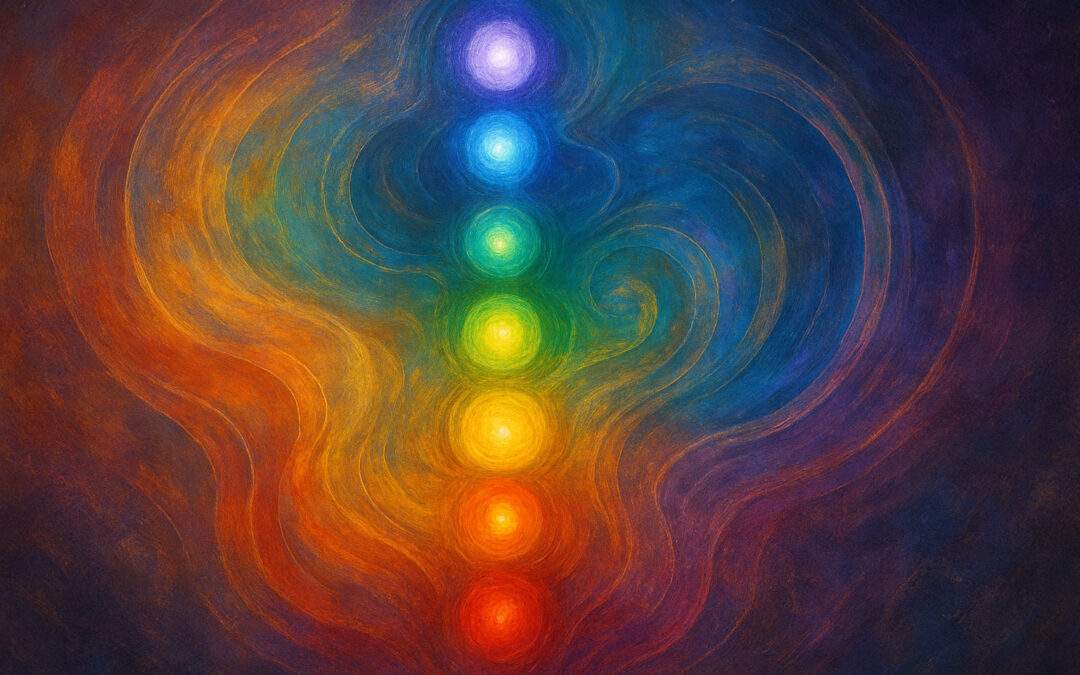
2. The Spiritual Symbolism of Color
Colors carry deep spiritual and cultural symbolism that can amplify your brand’s message:
- Red: Life force, root chakra grounding, primal drive
- Orange: Sacral chakra creativity, joy, sensuality
- Yellow: Solar plexus empowerment, light, divine clarity
- Green: Heart chakra love, renewal, balance
- Blue: Throat chakra truth, flow, intuitive communication
- Purple: Crown chakra connection, mysticism, higher wisdom
- Gold: Sacred abundance, divine illumination
3. Aligning Color With Your Brand’s Story
To create a palette that speaks to the soul, start by asking:
- What transformation do you help create?
- What values are at the heart of your brand?
- What emotional space do you want your audience to enter when they see your work?
Then, combine 2–3 core colors that reflect your message and 1–2 accent colors for flexibility. This is what we call aligning color with your brands story.

4. Examples of Color Alchemy in Action
- Wellness Coach: Soft greens + muted gold for healing and abundance
- Artist: Bold magentas + deep teal for creativity and emotional depth
- Spiritual Teacher: Lavender + white + gold for wisdom, peace, and light
5. How to Test Your Palette
- Mock up your colors in social media templates, website banners, and marketing materials.
- Check accessibility to ensure readability for all viewers.
- Ask your audience what emotions your palette evokes — sometimes they feel something you didn’t expect.
Let’s Craft Your Designs Together
Your brand colors are more than just a pretty combination — they’re an energetic invitation. When you choose colors that align with both the psychology and the spiritual essence of your brand, you create a visual vibration your ideal clients can’t help but resonate with.
Ready to create a color palette that tells your story and speaks to your audience’s soul?

