

Using graphic details effectively allows creators to communicate complex settings to target readers instantly. These visual cues transcend language, acting as an unspoken contract between the storyteller and the audience. Moreover, they set the mood before a single word of narrative begins.
The Power of Graphic Details in Genre
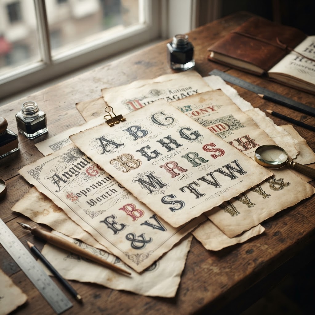
Every genre relies on established visual shorthand to establish credibility. For example, fantasy novels often utilize ornate, serif typography to signal antiquity or magical origins. In contrast, modern thrillers frequently employ clean, sans-serif fonts to denote a fast-paced, contemporary environment. Therefore, understanding these subtle signals helps maintain genre consistency.
Furthermore, these elements ground the reader in the story’s world. By carefully curating every pixel, designers guide the emotional experience of the user. You can explore more about design standards at AIGA to deepen your technical knowledge. Consistent application of these visual motifs builds trust with your audience.
Mastering Texture and Typography
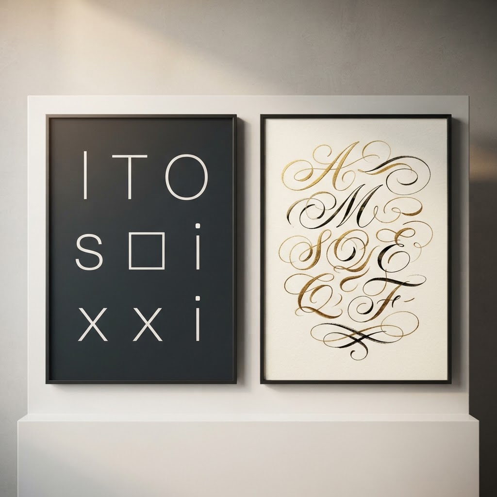
Textured details are just as critical as typography in defining a setting. A weathered paper texture suggests a story rooted in the past or discovery. Conversely, a metallic or holographic finish implies a futuristic, high-tech reality. Consequently, these choices act as silent storytellers that work in tandem with written prose.
Moreover, developers must consider how these visuals interact with their target readers via NNG research insights. A mismatch between visual cues and genre expectations often leads to confusion. To illustrate, a horror story with whimsical, bright fonts fails to convey the necessary dread. Hence, alignment remains the ultimate goal for any successful project.
Tactical Tips for Visual Storytelling
First, analyze the standard tropes within your specific niche. What colors, textures, and fonts appear most frequently? After identifying these, you can choose to follow them or intentionally subvert them for effect. However, always prioritize clarity for your intended audience.
In addition, maintain a cohesive visual hierarchy throughout your design. When every element serves the overall theme, the narrative becomes more immersive. Finally, remember that less is often more. Strategic placement of visual markers creates a more powerful impact than excessive ornamentation.